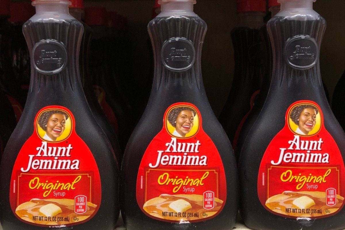
Aunt Jemima Bottles
Photo Credit: Benno Schwinghammer for Getty Images

After receiving backlash for years Aunt Jemima has moved on from its racist beginnings and rebranded.
The last time the brand name made headlines Quaker Oats acknowledged it would move away from using its racially insensitive branding. On Tuesday, Quaker Oats’ parent company PepsiCo announced the replacement name: Pearl Milling Company.
“We are starting a new day with Pearl Milling Company,” said a PepsiCo spokesperson reports CNN. “A new day rooted in the brand’s historic beginnings and its mission to create moments that matter at the breakfast table.”

The story of Aunt Jemima begins with Nancy Green, a woman born a slave who the caricature was based on. Chris L. Rutt, founder of the company named his business after the “Old Aunt Jemima.” The term was also an 1875 minstrel show song previously performed in blackface. Soul singer Kirby poked fun at the brand’s name last summer in a viral clip amid the protests that followed the killings of unarmed Blacks throughout the nation.
After the TikTok garnered attention, Quaker Oats announced the insensitive name and packaging would be retired. In June of last year, the company acknowledged its “origins were based on a racial stereotype.”
“This name is a nod to where our delicious products began before becoming a family-favorite breakfast staple,” said PepsiCo. “While the Aunt Jemima brand was updated over the years in a manner intended to remove racial stereotypes, it has not progressed enough to appropriately reflect the dignity, respect and warmth that we stand for today.”
It isn’t surprising that though the new logo completely omits the familiar smiling face of Aunt Jemima, it kept the red, yellow and white color scheme. Aunt Jemima was replaced by a water mill.
Per People, PepsiCo also shared the new brand was created with inclusivity and diversity in mind. Diverse agency partners, consumers, employees and others contributed to the rebranding.